If you've found yourself getting confused overhearing a lot of people talking about the "look" or "aesthetic" of their Instagram Feeds lately, don't worry.

We are here to teach you what that means and how to make sure your Instagram is looking 10/10!
What does "Instagram Aesthetic" actually mean?
Essentially the "Instagram Aesthetic" is the look and feeling you get from jumping onto someone's Instagram page.
You may see a particular range of colours that are used, a specific theme of content or photography that is used. You may even notice a mood you feel when checking out a brand or person's Instagram Page for the first time.
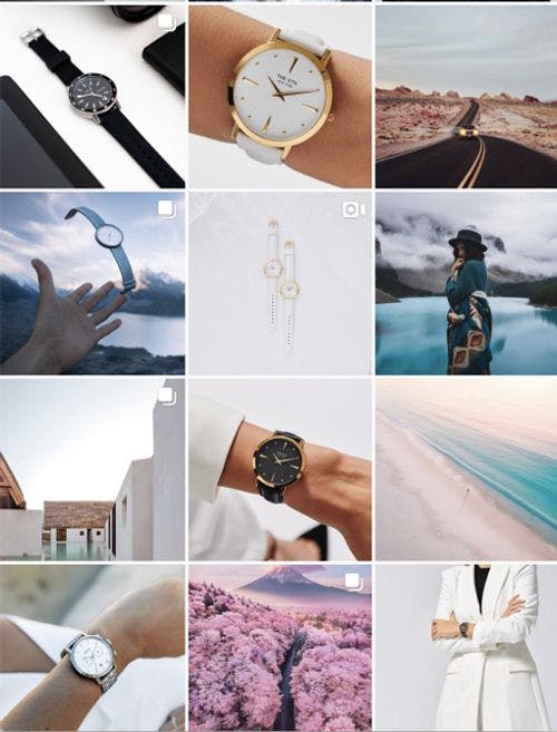
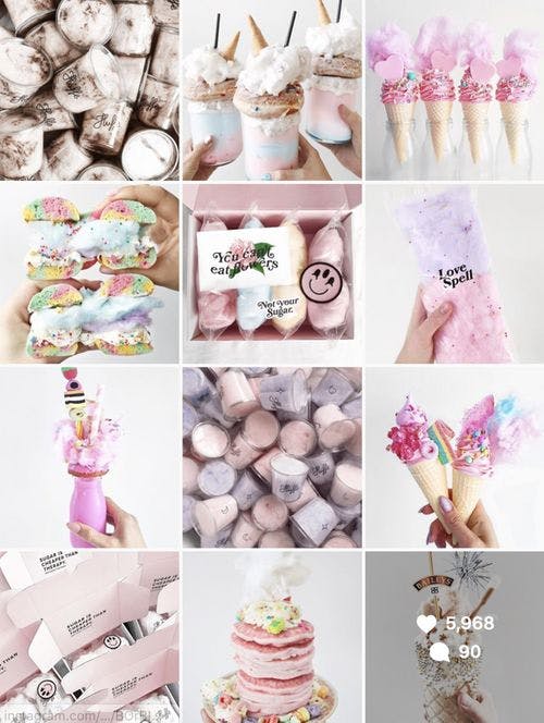
When you look at the below Instagram pages, both have very distinct "aesthetics" and "styles" that create a mood and tone to their branding.

Source: @the5th
This Instagram Aesthetic for @the5th is simple, professional and clean. Incorporating soft tones of pastel pinks, peach, soft blue and crisp white.
The images are all high quality with hardly any "clutter" to keep the minimalist look. You can feel a sense of high quality, luxury and travel when you view this Instagram feed. This aesthetic gives you a feeling of the essence of the brand when you purchase from The 5th.
However, if we jump to the next Instagram feed, in contrast. This is also very effective but using a completely different strategy.

Source: @fluffegram
This look is playful, colourful & vibrant! It creates a sense of happiness and joy when viewed. You can see the colour options are much more vivid with tones of Pink, Purple, Blue, pastel yellow and soft caramel. The images are busy yet professional, incorporating the use of flat lays.
Now you can see two perfect examples of how you can create different strategies with your own "Aesthetic" which can change an impression of your brand entirely.
How do we do this? Luckily, we have created 5 easy steps to start your journey on creating the ultimate "Instagram Aesthetic" for your brand or personal feed.
1. Pick Your Colours
Colour is very important and can initiate emotions & moods. You'll find some colours compliment each other well and others do not. Make sure to pick a variety of colours that reflect your branding and style.
For inspiration, try using platforms like Pinterest to find a mix of colours that work for you. Put them all together to see what kind of "aesthetic" or "mood" you can create.
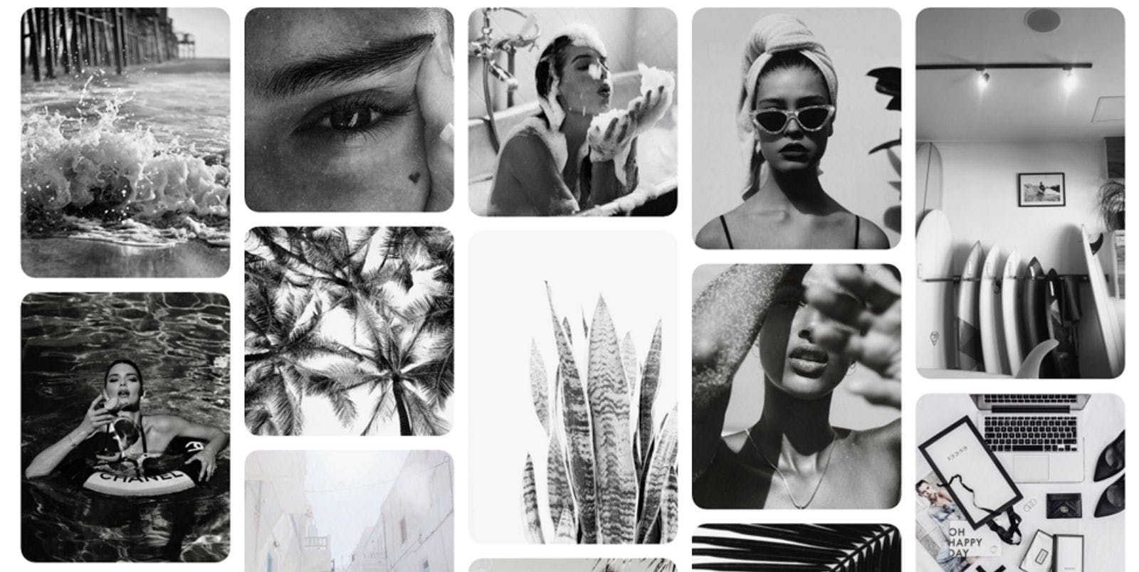
Below are two very different Pinterest mood board examples:

Beige and white aesthetic

Black and white aesthetic
2. Create Content For Your Aesthetic
Once you've found the colours you like it's time to create content that reflects these colours.
We recommend using a mix of your own photography content, along with UGC (user generated content) and potentially sharing (with approval & credit) images that other creative have on their own Instagram accounts that fit into the feed and overall mood of your brand/ personal brand.
Here's a list of free Instagram tools that can help you with putting the finishing touches on your content.
3. Be Consistent With Your Editing
This is a mistake a lot of people make when curating their Instagram feed. They may include images with different filters, different lighting, some blurry and others crisp and sharp.
This can create a messy and disorganized feed. This also can create an unprofessional and mixed view of the brand you're trying to portray.
Use tools like Snapseed or Lightroom to create the perfect edit or preset filter that will work across your feed to make it look cohesive.
4. Plan Your Content
This is the fun part! Once you have all of your content ready to go, and the images are edited in a similar fashion with a mix of planned colours, it's time to plan the feed.
Use apps like UNUM or PLANOLY to create a grid where you can move around and mix up your images to see how they look together before posting.
We like to use UNUM for ours and find a way to make sure all posts compliment and flow nicely with each other.
TIP: Ensure your colours flow evenly across the feed. If you're using images with lots of visual aspects incorporated, try to place them next to images that have a lot of space. This will ensure the feed doesn't look too messy.

Source: @decisionscafe
5. Keep It Up!
Another error we see a lot is people chopping and changing their Instagram Aesthetic too often. It's important once you've decided on your theme or colour scheme, stick with it!
Sure, it may evolve over time, but the key is consistency to keep up the beautiful Instagram feed you've worked so hard to create.
Make sure you decide how often you'll post, plan it before hand in your handy app and then keep up the good work.
Now you’re all set - it’s time to start creating your own Instagram Aesthetic that works for you and your brand.
